maandag, juni 04, 2012

Wayne Dyer : The Power Of Intention ! & The Shift

Wayne Dyer : The Power Of Intention !

Dr. Wayne Dyer has another term for the concept behind the Law of Attraction. He calls it the Power of Intention. His philosophy is pure and simple, "The law of attraction is this: You don't attract what you want. You attract what you are."

"Most people's mistake in trying to apply the law of attraction is they want things; they demand things. But God doesn't work that way," continues Dyer. "It's all about allowing."

Dyer refers to the Tao Te Ching, written by Lao Tzu. "He says in there, 2,500 years ago, if you live from these virtues, then all that you could ever need or want could be provided for you." Dyer excitedly retrieves his personal copy of the book, leans forward and reads the words that touch him so deeply. He explains how virtue is a very important concept in the Law of Attraction.


"This is called the Hua Hu Ching, written by Lao Tzu. It's the unknown teachings of Lao Tzu. Number 51 says, 'Those who want to know the truth of the universe should practice the four cardinal virtues. The first is reverence for all of life. This manifests as unconditional love and respect for oneself and all other beings. The second is natural sincerity. This manifests as honesty, simplicity and faithfulness. The third is gentleness, which manifests as kindness, consideration for others and sensitivity to spiritual truth. The fourth is supportiveness. This manifests as service to others without expectation of reward."

"All great spiritual masters are teaching what we're talking about," says Dyer. "They're teaching forgiveness. They're teaching kindness. They're teaching love. They're not teaching wanting. They're not teaching greed."

So the notion of seeking what you want, or think you need, is not what the Power of Intention is all about. "The ego's mantra is 'What's in it for me? How can I get more? I want a BMW in my driveway next Thursday,'" he explains. "All of that is what most spiritual teachers call the false self—the ego."

According to Dyer, the process of allowing, just being and embracing this heightened level of consciousness, goes back not to attracting what you want, but attracting what you are.

"You have to just be. You have to let go. You have to allow. You have to be free and make this your consciousness." He continues, "Basically, what you would see is a frequency (of energy) that manifests itself through the process of giving, of allowing, of offering and of serving. It asks nothing back."

Dyer illustrates the concept of giving without expectations by quoting the great poet Hafiz: "Even after all this time, the sun never says to the earth 'you owe me.'"

Excitement and energy permeate the room as Dyer finishes his thought, "Just think of what a love like that can do. It lights up the whole world."

Dr. Wayne Dyer is an internationally renowned author and speaker in the field of self-improvement. He has written more than 30 books—many of which were featured as National Public Television specials—created numerous audio and video programs, and appeared on thousands of television and radio shows.

His new movie, The Shift, is available at HayHouse.com.

maandag, mei 21, 2012

amsterdamboomer shared an Instagram photo with you

Hi there,

amsterdamboomer just shared an Instagram photo with you:


view full image

"Sunsets The White Flowers have power"

Thanks,
The Instagram Team

Chrome Surpasses Internet Explorer as World's Most Popular Browser

For all of you who belief that IE is still ahead ( except from spreading virussus and spyware and other malicious code to your computer ) on the competition.....

Read this and be aware that if you build a website worth reading by your clients - adapt to standards and lose the weight of the losers !!!!!


Chrome Surpasses Internet Explorer as World's Most Popular Browser  
Monday, 21st May 2012, 04:05 pm   
This entry needs translation. To help us and submit a translation please click here

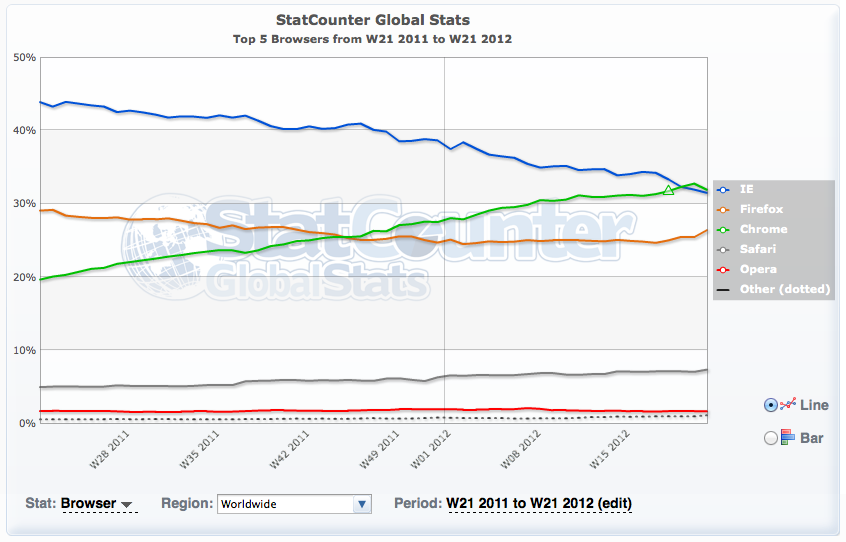
Chrome has surpassed Internet Explorer as the world's most popular browser, according to data from StatCounter.

The chart below shows Chrome with a higher traffic share over the full week of May 14th–20th.

Take a look!

Read More [via Verge]


http://www.iclarified.com/entry/index.php?enid=22085

iClarified - Apple News - Quick Info Sheet for iOS 5.1.1 Untethered Jailbreak

Great News for those who wanna stay free & njoy all capabilities of their Devices !!!!


MuscleNerd from the iPhone Dev-Team has posted some details on the upcoming untethered jailbreak from pod2g.

---
● All info below is tentative and subject to last minute refinements

● @pod2g's 5.1.1 jailbreak+untether is working out great. All devices are covered except for AppleTV3,1, which currently has no path for jailbreaking.
- the initial 5.1.1 plan used a kernel exploit from @westbaer which unfortunately precluded use in iPod3,1 and iPhone2,1
- @planetbeing stepped up and provided a kernel exploit that covers both of those. Those two JBers are the bomb!

● The 5.1.1 A5 JB is very similar to the A5 5.0.1 JB. @pimskeks has done a tremendous job supporting both 5.0.1 and 5.1.1 in absinthe

● Similar to 5.0.1, there will also be a 5.1.1 CLI "cinject" binary and redsn0w version of the 5.1.1 JB+untether. Absinthe, cinject, and redsn0w will all provide the same JB in different fashions.
- timing is indeterminate. Plans are for this week, but a number of factors can influence that.

● For those wishing to donate, we've set up a new 5.1.1 paypal URL: https://www.paypal.com/cgi-bin/webscr?cmd=_s-xclick&hosted_button_id=4U6DQGJ2NRVUN

● Please don't pirate AppStore apps (seriously, please do not).
---

The jailbreak is set for release very shortly. You can check out the video below and follow iClarified on Twitter, Facebook, or RSS to be notified of the jailbreak's release.

Read More

http://www.iclarified.com/entry/index.php?enid=22079

amsterdamboomer shared an Instagram photo with you

Hi there,

amsterdamboomer just shared an Instagram photo with you:


view full image

"Oranje boven "

Thanks,
The Instagram Team

amsterdamboomer shared an Instagram photo with you

Hi there,

amsterdamboomer just shared an Instagram photo with you:


view full image

"Blooming Reiki business relax in the garden "

Thanks,
The Instagram Team

maandag, maart 26, 2012

Tutorial: Take your minimalist web design from Photoshop to HTML part 1 | TechRepublic

Tutorial: Take your minimalist web design from Photoshop to HTML

Takeaway: Ryan Boudreaux follows up on his tutorial for creating a minimalist layout in Photoshop by showing how to take that PSD file and turn it into HTML.

Following up from a recent tutorial on creating a minimalist website design using Photoshop, I am going to demonstrate how to take that design from Photoshop to HTML in response to TR member dougried's request. This is the first segment of three parts, which will take you through the process, step-by-step. The PSD file will be used as a roadmap for creating an HTML template file and the associated stylesheet that will fit the look and feel of the original PSD. The PSD serves as a "smart" wireframe, as it contains the cues we will use for building the foundation and styling with CSS, CSS3 and several HTML5 elements. All files needed for this demonstration are included in the download (zip file).

Before we get started, here are the two parts of the original tutorial:

Separating the elements of the original PSD file

First, we need to un-compress the download file to a working location, and then open the PSD file (Minimalist_Template_Final.psd) in Photoshop as shown in Figure A below. Now, we can start with our dissecting of the background images. (The PSD file will also play double duty as our wireframe as we begin creating our styles and code for the HTML.)

We want to organize our layout in such a way that it can be put into defined sections such as rows, columns, blocks, or tiles so that they can be rendered using the coding and styling. The text and images in the PSD layout are going to be added on top of the background layers and can be placed easily with styling and code.

Figure A

In Photoshop we will create several individual images of the main content and background section starting with separating the header section from the body, and then the footer section. The body background will be a separate container, and we will eventually create sections with HTML5 <section> tags in the coding to piece it all back together. The text and images in the PSD layout are added layers on top of the background layers and can be replaced easily with styling and HTML code. It is the background elements that will need to be separated, and in this first section, we will copy the "Background" layer with the gradient and save it as a separate gif file named background.gif.

Next, unselect all the other layers in the PSD file leaving the "Background" layer visible.

Then, save the file in your web images directory (web/images) using the Save for Web & Devices… selection as background.gif.

The screen capture in Figure B displays the background layer selection.

Figure B

Next, we will create a separate image for the web name and subheading. To preserve the translucent background of the text sections we will:

  • Make the "Web Site Name" visible and make sure all other layers are hidden.
  • Use the Crop Tool (C) to surround the headings and accept the horizontal selection, then save the image in your web images directory using the Save for Web & Devices… selection as headername.gif. See Figures C and D below.
  • Make sure you "Step Backward" (Alt+Ctrl+Z) to get the PSD file back to its original state.

Figure C

Figure D

Next, the featured image will be cropped out and saved as a separate gif.

  • Make the "bg" layer and "Image Bg" layer visible, and make sure all other layers are hidden.
  • Use the Crop Tool (C) to surround the two background image layers and accept the selection, then save the image in your web images directory (web\images) using the Save for Web & Devices… selection as feature.gif. See Figure E and Figure F below.
  • Be sure to return the PSD to its original state by using the "Step Backward" (Alt+Ctrl+Z).

Figure E

Figure F

Included in the original download file are two more PSD image files for the "Connected" and "Social" icon. I have converted the two original PSD files to gifs and saved them for your convenience, and they are in the web images directory (web\images) as Connected_Icons.gif and Social_Icons.gif. These two images are both displayed in Figure G below for reference sake.

Figure G

Now that we have the major pieces of the PSD broken down into specific sections, it is time to start creating some HTML code and then the styles, based on the wireframe layout. Below is the basic HTML code to get us started with an outline within the <body> tags of the document and it is saved as the web document index.html.

    <section id="main">
      <section class="container">
            <header id="header">
          <p>Header Stuff Goes in Here</p>
        </header>
        <section id="main_content">
          <section id="left_sidebar">
            <p>Left Column </p>
          </section>
          <section id="right_column">
            <p>Right Column</p>
              <section>
                  <img src="images/feature.gif" />
              </section>
              <article id="left_feature">
                <p>Left Feature Article</p>
              </article>
              <article id="right_feature">
                <p>Right Feature Article</p>
              </article>
          </section>
        </section>
      </section>
        <footer id="footer" class="footcon">
          <p>Footer Stuff Goes in Here </p>
        </footer>
    </section>

Next, we will start adding in the styles to bring the code alive as we transform the PSD layout file into a working web document. We will start with some basic styles just to get the header, footer, sections and articles defined, and we will tweak some of them as we move through the tutorial. The styles are displayed below and saved as the document styles.css. The 1 pixel solid red border is a temporary style for this step to show the container separations, which you will see displayed below.

/*CSS Styles  */
body {
      background-color:#b9c7c7;
}
#header {
      border:1px solid red;
}
#footer {
      border:1px solid red;
}
.container {
      width:1020px;
      min-height:1020px;
      margin:0 auto;
      border:1px solid red;
}
.footcon {
      width:1020px;
      margin:0 auto;
      border:1px solid red;
      min-height:120px;
}
#right_column {
 margin-top:50px;
 float:left;
 top:0;
 right:0;
 width:610px;
 min-height:700px;
 overflow:auto;
 padding-left:5px;
 padding-right:5px;
}
#left_sidebar {
 margin-top:10px;
 margin-left:50px;
 float:left;
 top:0;
 left:0;
 width:200px;
 min-height:750px;
 overflow:auto;
 padding-left:5px;
 padding-right:5px;
}
#left_feature {
 margin-top:50px;
 margin-right:5px;
 float:left;
 min-height:250px;
 overflow:auto;
 width:280px;
}
#right_feature {
 margin-top:50px;
 margin-left:5px;
 float:right;
 min-height:250px;
 overflow:auto;
 width:280px;
}

Figure H shows how our index.html renders as displayed in Chrome 17.09:

Figure H

Now, let's add in the gradient image into our "container" section for the background by adding these two lines to our ".container" style:

background-image:url(images/background.gif);
background-repeat:no-repeat;

Figure I shows the resulting change, rendered in Chrome 17.09:

Figure I

The update is subtle, but the gradient is now visible from behind the feature image.

This concludes the first part of the tutorial. I will pick up in the next segment with adding in more styles for the remaining images, creating a gradient style for the footer area, and adding in the content text and linking for the navigation and other features.

Get IT Tips, news, and reviews delivered directly to your inbox by subscribing to TechRepublic's free newsletters.


http://www.techrepublic.com/blog/webmaster/tutorial-take-your-minimalist-web-design-from-photoshop-to-html/1346?tag=content%3Bsiu-container

Tutorial: Take your minimalist web design from Photoshop to HTML, part 2 | TechRepublic

Tutorial: Take your minimalist web design from Photoshop to HTML, part 2

Takeaway: Ryan Boudreaux continues his tutorial, taking a minimalist web design from Photoshop to HTML. Here, more styles and code are added as the final design is built.

In my last post, "Tutorial: Take your minimalist web design from Photoshop to HTML," we started work on splitting up the PSD file and created background images for the HTML page and then started our foundation HTML code (index.html) and some styles to establish the different sections (styles.css). Our initial styles set the main, container, header, left sidebar column, and right sidebar column, which also includes the feature content sections for an image and two feature articles. The download contains all the files utilized in this demonstration.

Adding styles and building the HTML

Picking up where we left off in the previous piece, we will start with adding in more styles for the remaining images, adding in the content text and linking for the navigation section, titles for the featured article sections, and feature content. Figure A shows how our index.html file looks at this point, as rendered in Chrome 17.0.9:

Figure A

Let's start with adding in the header image to the top left of the header section. To enable the image to be viewed, we will add in several lines of styles to the styles.css file, and we will add some textual content to the index.html file as well. I've kept the solid 1 pixel red border for now, but it will be removed as we move through the tutorial. The headername.gif file is called as a background-image as a URL, the height is set at 100px, the margin-top is set to 50px, the font-family, size and color are set to Tahoma, 14px, and #4b6262 respectively, and then a top padding of 18px and left padding of 15px rounds out the styling code additions to the styles.css file, which are displayed below:

Header styles:
#header {
border:1px solid red;
background-image:url(images/headername.gif);
background-repeat:no-repeat;
height:100px;
margin-top:50px;
font-family:Tahoma, Geneva, sans-serif;
font-size:14px;
font-weight:normal;
color:#4b6262;
padding-top:18px;
padding-left:15px;
}
The HTML code added to the header of the index.html file:
<header id="header">
<h1>The sub-heading slogan or catch phrase</h1>
</header>

Figure B shows the updates above as rendered in Chrome 17.0.9:

Figure B

Next, we will create our search bar and submit button for the final piece of the header section. Before we start with the code, we will need to capture the submit button arrow that we created in the original PSD file (see download). Using the same procedures as in the first segment of the tutorial, we will open the PSD file in Photoshop and make the button layers the only visible layers, crop to fit the arrow and gradient, size it to around 50×35 pixels, and then save it as a web-ready gif and name it search_button.gif, saving into the web images directory:

Figure C

The code for the search bar includes several CSS3 additions for gradients, border radius, box shadow, and backgrounds; the updates to the styles.css file are displayed below:

/* Search Form Styles */
#form {
margin-left:700px;
}
.search {
display: inline-block;
zoom: 1; /* display:inline-block for IE7 */
*display: inline;
border: solid 1px #d2d2d2;
padding: 1px 1px;
-webkit-border-radius: 7px;
-moz-border-radius: 7px;
border-radius: 7px;
-webkit-box-shadow: 0 1px 0px rgba(0,0,0,.1);
-moz-box-shadow: 0 1px 0px rgba(0,0,0,.1);
box-shadow: 0 1px 0px rgba(0,0,0,.1);
background: #b9c7c7;
background: -webkit-gradient(linear, left top, left bottom, from(#b9c7c7), to(#ededed));
background: -moz-linear-gradient(top,  #b9c7c7,  #ededed);
filter:  progid:DXImageTransform.Microsoft.gradient(startColorstr='#b9c7c7', endColorstr='#ededed'); /* ie7 */
-ms-filter:  progid:DXImageTransform.Microsoft.gradient(startColorstr='#b9c7c7', endColorstr='#ededed'); /* ie8 */
}
.search input {
font-family:Tahoma, Geneva, sans-serif;
font-size:22px;
color:#e0e9e9;
}
.search .field {
background: #b9c7c7;
padding: 0px 2px 3px 12px;
width: 190px;
border: solid 1px #bcbbbb;
outline: none;
-webkit-border-radius: 7px;
-moz-border-radius: 7p;
border-radius: 7px;
-moz-box-shadow: inset 0 1px 2px rgba(0,0,0,.2);
-webkit-box-shadow: inset 0 1px 2px rgba(0,0,0,.2);
box-shadow: inset 0 1px 2px rgba(0,0,0,.2);
}
.search .button {
margin-bottom:-10px;
}

And the HTML <form> section and code is added to the header section just below the <h1> sub-title in the index.html file as displayed below:

<section id="form">
<form class="search">
<input class="field" type="text" value="Search..." onfocus="if (this.value == 'Search...') {this.value = '';}" onblur="if (this.value == '') {this.value = 'Search...';}" />
<input class="button" value="" type="image" src="images/search_button.gif"/>
</form>
</section>

Figure D shows the resulting header section as displayed in Chrome 17.0.9:

Figure D

The search functionality included in the <form> for this tutorial is for demonstration purposes only, and will not actually be a working search. (A database back end connection would need to be implemented for searchable content results. )

Next, we will add in the styling and HTML for the left navigation sidebar with the "About", "Blog", "Products", "Services", and "Contact" textual content. All hyperlinks will point to "dummy" pages to keep this tutorial moving along; however, should you want to link to actual sub-pages all you need to do is use the final index.html file as a template, and rename them as necessary for the remaining pages. First the HTML for the navigation is set into an unordered list and is the only code added to the left sidebar section as displayed below:

<section id="main_content">
<section id="left_sidebar">
<ul>
<li><a href="#">About</a></li><br />
<li><a href="#">Blog</a></li><br />
<li><a href="#">Products</a></li><br />
<li><a href="#">Services</a></li><br />
<li><a href="#">Contact</a></li>
</ul>
</section>

And the CSS styling is added to the left sidebar for anchor and list items, and with one modification to the margin set to -35px for alignment.

#left_sidebar {
margin-top:10px;
margin-left:-35px;
float:left;
top:0;
left:0;
width:200px;
min-height:750px;
overflow:auto;
padding-left:5px;
padding-right:5px;
}
#left_sidebar a, li {
font-family:Tahoma, Geneva, sans-serif;
font-size:22px;
font-style:normal;
font-weight:600;
color:#4b6262;
text-decoration:none;
list-style:none;
}

Figure E shows the resulting updates for the navigation section as rendered in Chrome 17.0.9:

Figure E

Next, we will add in the styling for our featured content areas which are separated into the left and right sub-sections within the right column section and just below the feature image. The styling additions to the right column includes font and some CSS3 text shadow effect for the feature titles and a separate font styling for the feature article, the additional styles which were added to the style.css file are displayed below:

#right_column .feature_title {
font-family:Tahoma, Geneva, sans-serif;
font-size:22px;
font-weight:500;
color:#1f2626;
margin-top:-5px;
text-shadow: 2px 1px 2px #656e6e;
filter: dropshadow(color=#656e6e, offx=2, offy=1);
}
#right_column .feature_article {
font-family:Verdana, Geneva, sans-serif;
font-size:14;
font-weight:normal;
}

The HTML code added to the index.html file is displayed below:

<article id="left_feature">
<p class="feature_title">Featured Content Title 1</p>
<p class="feature_article">"Lorem ipsum dolor sit amet, consectetur adipisicing elit, sed do eiusmod tempor incididunt ut labore et dolore magna aliqua. Ut enim ad minim veniam, quis nostrud exercitation ullamco laboris nisi ut aliquip ex ea commodo consequat. Duis aute irure dolor in reprehenderit in voluptate velit esse cillum dolore eu fugiat nulla pariatur. Excepteur sint occaecat cupidatat non proident, sunt in culpa qui officia deserunt mollit anim id est laborum."</p>
</article>
<article id="right_feature">
<p class="feature_title">Featured Content Title 2</p>
<p class="feature_article">"Lorem ipsum dolor sit amet, consectetur adipisicing elit, sed do eiusmod tempor incididunt ut labore et dolore magna aliqua. Ut enim ad minim veniam, quis nostrud exercitation ullamco laboris nisi ut aliquip ex ea commodo consequat. Duis aute irure dolor in reprehenderit in voluptate velit esse cillum dolore eu fugiat nulla pariatur. Excepteur sint occaecat cupidatat non proident, sunt in culpa qui officia deserunt mollit anim id est laborum."</p>
</article>

Figure F shows the result with the feature article sections as displayed in Chrome 17.0.9:

Figure F

Figure G shows the web page as it stands with the latest HTML and CSS styles added and with the red borders removed from the header and container sections, but the footer section's red border remains to differentiate it from the sections that have been converted.

Figure G

The third and final segment of the Minimalist PSD to HTML tutorial series will conclude with adding in the footer section, including creating a CSS3-styled gradient.

Get IT Tips, news, and reviews delivered directly to your inbox by subscribing to TechRepublic's free newsletters.

Ryan Boudreaux

About Ryan Boudreaux

Ryan's experience includes a broad range of technology support roles and web development expertise.


http://www.techrepublic.com/blog/webmaster/tutorial-take-your-minimalist-web-design-from-photoshop-to-html-part-2/1368?tag=content%3Bsiu-container

Tutorial: Take your minimalist web design from Photoshop to HTML, part 3 | TechRepublic

Tutorial: Take your minimalist web design from Photoshop to HTML, part 3

Takeaway: Ryan Boudreaux completes his three-part series on taking a minimalist web design from Photoshop to HTML. Here, he adds the finishing touches to the code for the footer section.

This is third and final segment in the series of our series on converting a minimalist web design in Photoshop to HTML. Here are the first two, if you missed them:

All the files associated with this tutorial are available in the download.

In fact, if you want to go all the way back, check out the original series on creating a minimalist website layout using Photoshop which prompted the PSD to HTML series:

Figure A shows the web design as it stands after the first two parts in building the index.html web document have been completed, as displayed in Chrome 17.0.9.

Figure A

In the final segment, all we have left is adding in the styling and content for the footer section, which is surrounded in the red border above. We will start with creating a CSS3-styled gradient.

First, let's open the PSD file one last time, and in this step we are going to use the footer area gradient layer to help us capture and create the CSS3 styles we are going to utilize for our web document.

  • Make sure the "Footer' layer is active and the only visible layer, then select the Crop Tool (C).
  • Now, select a slice of the gradient within the footer, being sure to select the entire top to bottom of the gradient; the width does not really matter, but in my instance, I selected a portion that is about 100px wide.
  • Press enter to accept the crop; the selection is shown in Figure B:

Figure B

  • Next, select File, and then Save for Web… and name it footer_ gradient.gif; save it to your working folder. We will use this gradient "snapshot" for our next step. RGB 99, 112, 111: HEX62716f,  and RGB 116, 143, 143: HEX 748f8f

One of my favorite online tools is the Ultimate CSS Gradient Generator by ColorZilla, which allows you to create a variety of gradients including horizontals, verticals and radials. We'll use it for the next part.

Once on the Gradient Generator website, I am going to select Import From Image. The button is pointed out with the red arrow as displayed in Figure C.

Figure C

Now, select Choose File and browse to the footer_gradient.gif file; select Open, and then, once the file name appears in the dialog box, select Import, as shown in Figure D below.

Figure D

The CSS gradient styling for background, linear-background, and filter stops will be created as a custom set. Before we accept the generated code, we can now update the color stops to more accurately reflect the effect that closely matches the gradient we created in the PSD. We will first set the first color stop to 60% and the second color stop to 80%. You can also name the custom set and save the unique permalink for future reference. The resulting generated gradient output is displayed below in Figure E, and the style code is included just below the screen capture.

Figure E

I've manually added in the fixed width of 1020px, the margin set to 0 and auto, and the height set to 100px to the top of the foot container styling.

.footcon {
width:1020px;
margin:0 auto;
height:100px;
background: #748f8f; /* Old browsers */
background: -moz-linear-gradient(top,  #748f8f 0%, #748f8f 60%, #728c8b 80%, #677777 100%); /* FF3.6+ */
background: -webkit-gradient(linear, left top, left bottom, color-stop(0%,#748f8f), color-stop(60%,#748f8f), color-stop(80%,#728c8b), color-stop(100%,#677777)); /*              Chrome,Safari4+ */
background: -webkit-linear-gradient(top,  #748f8f 0%,#748f8f 60%,#728c8b 80%,#677777 100%); /* Chrome10+,Safari5.1+ */
background: -o-linear-gradient(top,  #748f8f 0%,#748f8f 60%,#728c8b 80%,#677777 100%); /* Opera 11.10+ */
background: -ms-linear-gradient(top,  #748f8f 0%,#748f8f 60%,#728c8b 80%,#677777 100%); /* IE10+ */
background: linear-gradient(top,  #748f8f 0%,#748f8f 60%,#728c8b 80%,#677777 100%); /* W3C */
filter: progid:DXImageTransform.Microsoft.gradient( startColorstr='#748f8f', endColorstr='#677777',GradientType=0 ); /* IE6-9 */
}

We will now add these styles to our styles.css file, updating the footer container styles that create the four columns, and we will also remove the red border. Now, let's view the index.html file in Chrome 17.0.9, displayed in Figure F:

Next, we will add in the four columns to the footer : Social Networking, Stay Connected, Participate, Copyright 2012, and Rights and Privacy Disclaimer. First we will create the sections and then add in the respective content.

From our PSD file, we see that all footer paragraph sections have the same font face, size, and styling of Lucinda sans Unicode, 12px, regular, and the color #ffffff. The font styling will follow these guidelines and are displayed below:

.column p {
font-family:"Lucida Sans Unicode", "Lucida Grande", sans-serif;
font-size:12px;
font-style:normal;
color:#ffffff;
text-align:left;
}

Next, we will set the styles for four columns that will fit within the defined footer area with the float left, margin set to 0 0 20px, left padding to 3%, and the width set to 22.5%, with the first column set to clear all and padding left of 0:

.column {
float: left;
margin: 0 0 20px;
padding-left: 3%;
width: 22.5%;
}
.first {
clear: all;
padding-left: 0;
}

Next, we will style the anchor text with text decoration set to none, a left margin of 25px, and the color set to #ffffff:

.column a {
text-decoration:none;
color:#ffffff;
margin-left:25px;
}

The disclaimer section uses identical styling as the footer section with the following styles defined:

.disclaimer  {
font-family:"Lucida Sans Unicode", "Lucida Grande", sans-serif;
font-size:12px;
font-style:normal;
color:#ffffff;
margin-left:180px;
}
.disclaimer a {
text-decoration:none;
color:#ffffff;
margin-left:240px;
}

The footer section HTML coded into the index.html file:

<br clear="left"/>
<footer class="footcon">
<article class="column first">
<p><a href="#">Contact Us</a><br />
<a href="#">FAQ's</a><br />
<a href="#">Accessibility</a><br />
<a href="#">Partners</a><br />
<a href="#">Portfolio</a>
</p>
</article>
<article class="column">
<p>SOCIAL NETWORKING</p>
<img src="images/Social_Icons.gif" />
</article>
<article class="column">
<p>STAY CONNECTED</p>
<img src="images/Connected_Icons.gif" />
</article>
<article class="column">
<p>PARTICIPATE<br />
We invite you to participate in our online community. Join our Facebook page, see our videos on YouTube,follow us on Twitter....</p>
</article>
</footer>
<section class="disclaimer">
<p>Copyright 2012 <a href="#">Rights and Privacy Disclaimer</a></p>
</section>

Here, the changes for the footer are displayed in Chrome 17.0.9:

Figure G

While the icons under Social Networking and Stay Connected are not anchored to links, it would not take much to split out the icons into individual image files and add linking to each. Or, another option would be to create an image map for each of the two footer images.

This completes the three-part series of converting the PSD file to HTML code. Figure H shows the completed website as displayed in Chrome 17.0.9:

Figure H

Get IT Tips, news, and reviews delivered directly to your inbox by subscribing to TechRepublic's free newsletters.

Selena Frye

About Selena Frye

Selena Frye is a Senior Editor at TechRepublic.com.


http://www.techrepublic.com/blog/webmaster/tutorial-take-your-minimalist-web-design-from-photoshop-to-html-part-3/1378?tag=nl.e075